

Redesign Logo
Houston Garden Centers
Houston Garden Centers
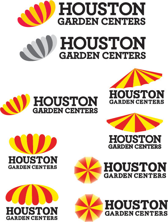
My final logo for Houston Garden Centers is different fromthe old one. I flip their umbrella so they look like flower, so it couldexpress more about garden centers. I still stick with the same hue of their oldcolor because people could recognize them. However, I choose to put more orangein the yellow and more pink in the red.
For typeface, I choose ArcherPro Bold. It has more curvesand friendlier look comparing to the old one. I still choose the serif typefacebecause I still want to contain the traditional feeling. I think most of thecostumers are people above 35 years old. They won’t appreciate hippy youngsan-serif typeface.
For typeface, I choose ArcherPro Bold. It has more curvesand friendlier look comparing to the old one. I still choose the serif typefacebecause I still want to contain the traditional feeling. I think most of thecostumers are people above 35 years old. They won’t appreciate hippy youngsan-serif typeface.

Finished Design

Comparing between the old logo and the new logo
Design Development

Colors Choices

Using in the web


Gift Card


